Who are The Digital Renegades?
It says it all on the front landing page of our site:
“Digital Renegades is a multi-award-winning team focused on web design and development.”
We know there isn’t a one-size-fits-all process for creating a digital space for your business. When a client chooses to work with our collective of experts, they choose to work with a proven team of real people who are driven to create a unique experience for each project.
And the Winner is…
Between 2022 and 2023, Digital Renegades won 8 different awards in total!
Vega Awards 2022
Centaury Winner (Gold)
Big Guy Big World – Category: Website & Mobile Sites – Travel / Tourism
Communicator Awards (29th Annual Award, 2023)
Awards of Excellence
2023 B2B Websites Winners
Let the Voters Decide – Category: General-Professional Services
Sustainable Culinary Solutions – Category: Features-Visual Appeal – Aesthetic
Awards of Distinction
2023 Consumer Marketing & Communication
Big Guy Big World – Category: General-Travel & Tourism
Food & Thought 2 – Category: General-Food & Drink
The Jacoby Foundation – Category: General-Social Responsibility
The City of Groveland Business Directory – Category: General-Community
A Deeper Dive Into Three Time Award Winning Website: Big Guy Big World
Big Guy Big World(BGBW) follows the world travel adventures of self-proclaimed big guy Mark Jacoby as he travels the world and brings others along for the ride. This is the reason why this site has been a three-time award winner for Digital Renegades.
A Case Study of Design Married with Storytelling | Three Time award-winning WebSite
The BGBW site is designed with smooth scrolls that tell a story while combining ease of navigation and use to have visitors along for the ride. Right away, users are greeted with uniform branding (no mismatched buttons!) that keeps the page neat and professional while displaying a recent blog selection menu front and center that rolls into a continental travel selection navigation bar with a world map to function as a visual aide.
Looking for a specific type of information about BGBW travels? No worries; the beautifully striking scrolling gallery menu is there to help you find the best food, attractions, experiences, and more. Now that you have a taste for travel, the page scrolls into a section titled “What We’re All About” with a simple paragraph, elevator pitch for what the company is, partnered with a short promotional video, all seamlessly worked into the page in a way that invites further clicks and exploration.
There are no annoying pop-ups or need to leave the site; everything is integrated and ready to use right there. Contrast plays a considerable part in the design of this unique site. Dark backgrounds precede bright pops of color from additional blog posts.
The page is finished again in contrasting colors that highlight a call to action and a navigation bar. This makes it easy to catch anything you might have missed while being pulled away into a rabbit hole of opulent and breathtaking travel photography and writing.
Big Guy Big World
What Makes a Digital Space Award Worthy?
We consider digital design and web development to be art in their own right. Design nuance leads to award-winning experiences, especially when our designs are broken into layers. Take, for example, the work we have done on our site. As you scroll, we use subtle motions to add depth to the overall narrative, maintaining a smooth consistency that keeps our users’ experience consistent and engaging.
Web Design & Digital Story Telling
Every digital space has a story to tell, and it can be broken down into the Elements of Structure/Story, much like any book or movie might. Examples are based on our proudest work to date, our very own website. This is us, going to the nth degree with the same tools we use for our clients, with a promise to put the same thought and care into each of our projects.
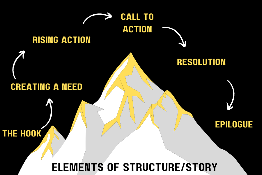
The Hook /Exposition
Think of something to draw your visitors in. This could be reflected in branding, eye-catching art, or exciting copy. This should be your focus, not only to grab but also to hold onto your attention. This is the thesis statement of who you are and what you do. Like almost any first impression, this is an important piece to nail.
Ex. Bold lettering and concise copy partner for a one-two punch of an intro to the Digital Renegades website. The smooth movement of the page is a hint of what is to come for movement through our digital space. This is who we are. This is what we do. It’s simple and to the point. It’s followed by a brief listing of brand partnerships we are currently working with or have worked with in the past.
Conflict/Creating a Need
Unlike in a narrative, this is less about actual conflict and more about showcasing the need your digital space fills for current and potential clients and visitors. It should focus on a significant issue your client may be facing and, in turn, show how you can help them with it.
Ex. Scroll past the introduction block, and more text glides onto the page: “Everything you need to outmaneuver your online competition.” This service need is created in a single sentence, followed by highlights that show why we are the ones to help you with that need.
Rising Action
This is going to be the bulk of most stories. Show the users the journey your brand has taken. This could look like blog pieces or a portfolio, but this is the time to show clients they want to be a part of your story too.
Ex. For our site specifically, this starts with a list of different skill sets we bring to the table. As you scroll down the pages, each individual offers something from digital architecture to design and insights. Then, to highlight these even further, they slide into a rotating portfolio of current and previous projects/clients.
Climax
This is the call to action and arguably the most critical piece of your digital space. You have caught attention, created a need, and have a solution, and now you need users to take the next step! What that next step looks like can vary depending on your business goals. Are you selling a product? This may look like something as simple as purchasing options through your site. If you are trying to spread more information and awareness, this step may look like a call to share or sign up for a newsletter for continued communication. Or, if you are like us and you are offering a service, this step may look like a form of interest to connect directly with your audience.
Ex. Once we have introduced ourselves, pinpointed a need, and shown how we can help meet that need while giving more background on what we do, the elegant black-and-white is interrupted by a striking yellow. The sudden change specifically highlights our call to action, an interest form for a consultation.
Resolution
Time to wrap it all up with any details that might have been missed along the way.
Here, simple is often best.
Ex. In this metaphor, the resolution is our footer. It offers a break from the vibrant yellow and heads back to the more reserved and elegant black and white and features important copyright and legal information, but is also host to navigation buttons that will take you back to the corresponding section one might want to review, including Vertex, Services, Case Studies, About, Blog, and Contact.
Epilogue
Just because a story is done, doesn’t mean the journey is over. We want clients who aren’t just looking for a template but want to stand out from their competition. We understand that creating a digital space isn’t a one-and-done deal, but instead is the creation of a living piece of software that requires care and cultivation. Digital Renegades doesn’t stop at the creation of a digital space, but offers maintenance and upkeep by a team of friendly and responsive professionals.
Who We Like to Work With
Our most successful clients are usually mid to large-size businesses that have a vision and a budget and are ready to collaborate to craft the perfect digital space. There is a lot of work on the client’s side at the start of any project because we need to understand the overall goals for their website and what they are trying to communicate. We gather all of this information via the Website Worksheet on our website. The Discovery Form consists of five pages and contains around thirty questions to help our team connect with a client’s vision.
One of the exciting things about that form is almost all the fields are not required, and we do get forms back with empty answers. Sometimes, it is because a question may not be relevant to the client or they just don’t want to answer. What’s really interesting is seeing the effort someone will put into it. Honestly that is usually how we can tell if a project will be a good fit or not. If we see a form come through and filled out with a single word in each field, or you can see that they haven’t put effort into it, we might not be able to do as well on that project. We want our clients to really be discovering and reflecting on their digital goals rather than trying to get it done like a worksheet. We encourage prospective clients to take as much time as they can on the Website Worksheet and really put some thought into it because they care about the results of the project. Most of the success in that first phase of design comes from what we get from the client from a communication standpoint.
Kevin Abrams, Co-founder of Digital Renegades
And who knows? Maybe our next award-winning digital space will be yours.
There is no time like the present to fill out the Website Worksheet and schedule a consultation!


Schedule a Call
Not sure if Digital Renegades is the right fit for your project? Schedule a consultation with our team and we'll help.